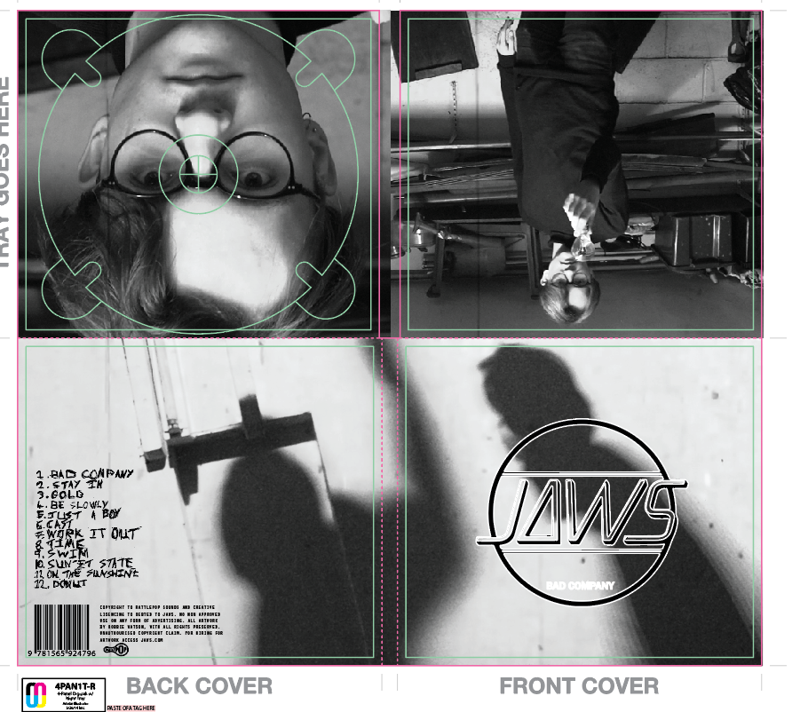
This is my final digipak, as you can see I have 3 different pictures on my digipak instead of the normal 4. This was done to purposely break conventions as it represents how my video is not the normal everyday video.
I also used my own font for the track list much like I did in my magazine advert. Furthermore I have also previously described how to put in my own pre made text in a different blog so refer to that for a description.
Also I found a vector of the rattle pop logo and a random barcode. This was useful as it meant I was able to easily for fill genre conventions. This is useful as it provides a familiar layout to that of a more professional real digipak.
Something that has not been seen on my magazine advert is the different pictures I used for example the one at the bottom of the two shadow figures. These were used because it provides mystery, which fits the genre of my video as throughout it has a storyline which is only revealed at the end so there is always an atmosphere of mystery and anticipation. Finally there is the close-up of the protagonist under where the disc is meant to be which would mean we would have the characters face reveal in a certain way.
Overall I really like my digipak as it fits my theme and looks like a typical digipak in my genre. However that is not to say that it is a copy of any other digpak's as it is very individualistic, mainly because they are actual screenshot of my A2 music video.

No comments:
Post a Comment