Friday, 24 March 2017

Rough Cut 2- Production Diary


Here is my second rough cut, I have made several developments that are noticeable including the use of Luts (Lookup table) which are simply just a preset collection of colour values that create certain Luts. I used the Lut seen in this picture in the effect controls- Creative section. It is called SL NOIR  TRI-X, I was lucky in the fact I found one that already sat within premiere pro.

They make a very significant difference to how the music video looks. As seen by the difference in the overall appearance of my 1st rough cut and this one.


Rough Cut 2 with LUT
Rough Cut 1 no LUT, saturation value 0
The application of the LUT as can be seen has made a huge difference to the quality of the footage as we can clearly see how the whites instantly look less blown out compared to the first rough cute. Furthermore it also enhances the blacks and shadows in the clips as seen by the larger shadow created by the shelf behind the protagonist. Finally, when you take a look in and around of the glasses it brings out more reflection and detail to the point you can almost pick out the pattern on the glasses. It also helped with a certain level of colour correction however this happened at a later point.

I also made several changes to the edit by creating much shorter cuts especially at the start, furthermore I worked to ensure it was more on the beat then previous times. This made it seem more like a music video then just a short film which is often hard to distinguish with my strong narrative my production relies on. In fact if you watch my video compared to my first rough cut the story is much further ahead than before with it being several shots ahead, but of course this had to be done to prepare for my third rough cut with titles inserted. This will then mean I will near a final cut however there is still along way to go with every clip to colour grade using the scopes I previously learnt to use.  

Thursday, 23 March 2017

Rough Cut 1- Production Diary


Above we see my first rough cut of my A2 music video. It is a basic culmination of all of my shots, it has no special effects apart from the fact I created an adjustment layer and adjusted the saturation value to nil, and added in cinematic bars at the bottom and top. I'm happy in general with the edit as it has the start of what I aimed to do. However it is still without the intertitles I plan to insert, but in the time being I shall just add dummy titles in so I can edit to the beat of the song as at the moment there is no point of accurate on the beat editing as I will only have to change it in later edits. Furthermore, I plan to colour correct my whole video by adjusting the basic settings such as highlights, shadows, blacks, whites, saturation and exposure. I may also look for a more appropriate lookup table (LUT), in order to improve the general aesthetic of the whole production as it produces a more cinematic look compared to the use of saturation which I currently have in place. I'm also considering changing the bars at the top and bottom of the screen and instead moving them to the sides to replicate the 4:3 frame old silent films have. Finally I feel the use of some new transitions at the end of the production would help tie the narrative together as it will bring a sense of continuity, as at the moment I feel the cuts feel robotic leaving a narrative which is unclear.

Monday, 20 February 2017

Final Magazine Advert


This here is my final magazine advert, as we can see I have a white band logo one which replicates a similar logo that has already been established by the band themselves. The white text I chose was in order to keep with the black and white silent film look, I did this because it makes the whole production more professional.

I also then proceeded to make my own font by drawing in normal biro pen and scanning it into my printer and scanner. I then put the scanned file on the memory stick and placed inside my computer, and opened it in Illustrator. Then I did the same as I previously did with my digipak and image traced the image After other tweaks I finally created this text font effect. Which I'm happy with overall.

I followed conventions of magazine adverts by adding the music production companies logo, this was hard to do as I was unable to get a vector online so I simply took a normal Jpeg and again image traced, which aloud me to create an image which appeared to be a vector. Finally I also made the colour of the production companies logo a grey transparent colour this was because the shape of the logo with the circular curves. As I did not want it to be predominate as most of my design has no smooth bendy edges.

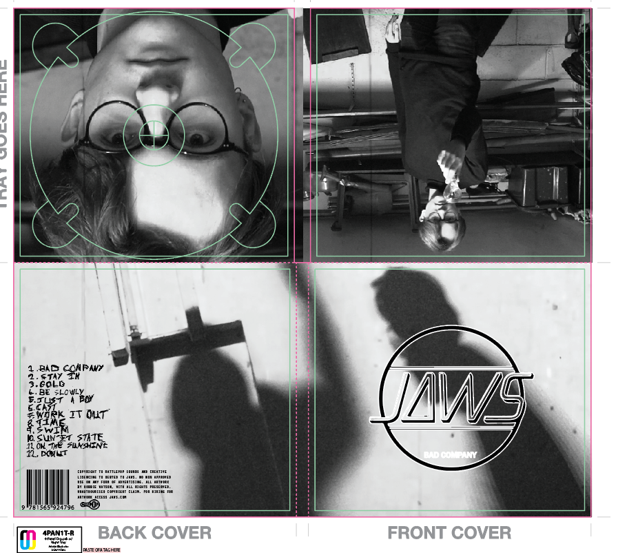
Final Digipak


This is my final digipak, as you can see I have 3 different pictures on my digipak instead of the normal 4. This was done to purposely break conventions as it represents how my video is not the normal everyday video.

I also used my own font for the track list much like I did in my magazine advert. Furthermore I have also previously described how to put in my own pre made text in a different blog so refer to that for a description.

Also I found a vector of the rattle pop logo and a random barcode. This was useful as it meant I was able to easily for fill genre conventions. This is useful as it provides a familiar layout to that of a more professional real digipak.

Something that has not been seen on my magazine advert is the different pictures I used for example the one at the bottom of the two shadow figures. These were used because it provides mystery, which fits the genre of my video as throughout it has a storyline which is only revealed at the end so there is always an atmosphere of mystery and anticipation. Finally there is the close-up of the protagonist under where the disc is meant to be which would mean we would have the characters face reveal in a certain way.

Overall I really like my digipak as it fits my theme and looks like a typical digipak in my genre. However that is not to say that it is a copy of any other digpak's as it is very individualistic, mainly because they are actual screenshot of my A2 music video.

Digipak Questionaire and Results

This questionnaire is very simple and has been put together in order to decide which digipak I will use for my final product.

Answer- Cross out the corresponding letter for the one you prefer.

A)
B)
C)
D)
E)


Results

From this questionnaire I have found out that I will use E as my final digipak as it got an overwhelming amount of votes with 16 of the possible 40 available. Although this is not a majority compared to the variation  D it has twice as many votes. This is significant as D got the second most votes. Peoples reasoning for voting for E was because it had the most simple and appealing colour way. With the JAWS badge being black and white instead of black and transparent or yellow and transparent. People really did not like A as they felt that yellow was an intrusion on the silent film aesthetic I have in my whole production. While people felt C and D were to similar so it probably split the vote.

Sunday, 19 February 2017

Magazine Advert Questionaire and Results

This is a questionnaire which when complete will allow me to choose the appropriate magazine advert for my AS coursework.

Cross out the letter that corresponds with the magazine advert you prefer.

A)

B)
C)

Result


The results show that B with the digipak has the most votes with a majority 28. The reasoning people gave to that was again much like the results with the digipak with the fact people preferred to keep the black and white aesthetic throughout the overall production. As they felt it created a more professional brand image. People felt that the red one did not sure indicative of love and romance than horror and said maybe I should have offered a yellow option as it is currently on trend. But I will not offer a magazine advert which is yellow as the digipak has been won by a black and  white option. So there is no need. 

My Final Magazine Advert's (Devleopment)

I have done a blog on the codes and conventions that consists of a list of typical things we see in music artists magazine adverts. During creating the following adverts I  followed those conventions however I did also go against some of them.

In this version of my magazine advert I made a variation with the yellow font of the text Bad Company.

In this version we see the Bad Company text and the track list in a red colour that could symbolize blood.

This is the simplest of all the designs with all the text a solid white colour, if any I prefer this one however I do plan to have a questionnaire to gain audience feedback in order to pick which on people prefer.