What is a Digipak?
A DigiPak normally has what is called a gatefold like a book. The outer packaging is often made of made of card/paper and the inner packaging tends to be made of plastic. They are normally used on special editions and albums by artists as they as seen to be more exclusive. Furthermore they have there downsides as they can be more vulnerable and likely to wear than the average hard back CD case. They first became popular with artists and record labels in the early 2000s .
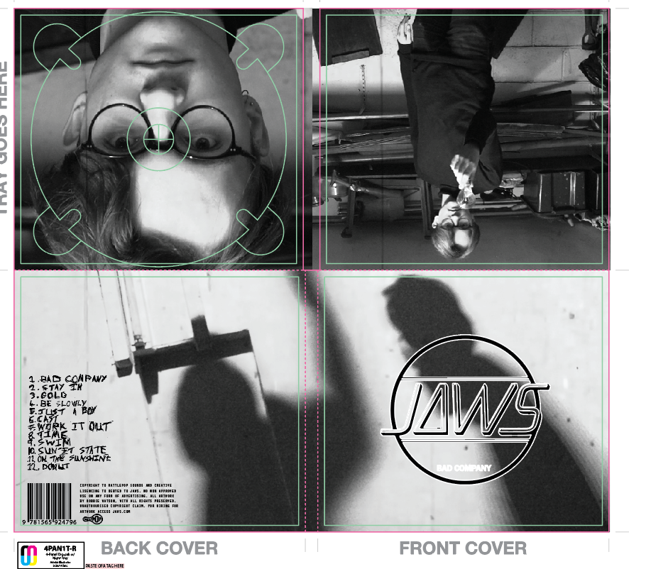
DigiPak's are designed to fold into a square CD case. They can fold many different ways and can have different amount of panels depending on what the artist feels he wants to involve. The front and back panels are called promoters’ and they are what is seen to cell the CD and are very much used to draw in the customers. The inside of the DigiPak is used more for information and extra bits to do with the artist/song/album. The theme of the inside packaging normally is more subtle compared to the outside packaging. The cardboard/paper normally folds around the plastic CD holder that is enclosed in the middle of the folds.
What tends to be on the front of Digipak's and why?

The front of DigiPaks tend to have a large eye-catching picture on the. The picture illustrated on the front panels tend to have some relation to the songs or artist this obviously varies between music artists as of the genre. The song/album title is also found on the front panel. This is all displayed by the picture we see to the right.
What is found on the inside of a digipak?
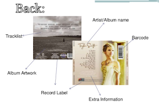
Artist/Album name Track list, barcode, album artwork, record label and any other extra information the artists wishes to be on there. In extended detail you could say you find the following inside a DigiPak. The plastic holder for the actual CD itself. A lot of plastic holders nowadays are see-through with another piece of album artwork behind which goes with the rest of the packaging. You can also find inside the pack itself more information and possibly more artwork to do with the disc. Extra information provided within the packaging could possibly include song lyrics, artist information and personal messages.

In Conclusion the following is normally found on a Digipak:
- Track list
- Album artwork
- Record label
- Extra information
- Barcode
- Artist name
- Album name
I have also done a digipak analysis as I think it will help me explain and improve my knowledge of digipaks and what you would commonly see.

For example here is one on Rihanna's Loud album. We firstly notice a large image on the inside of the digipak which presents the viewer with a lot of emotion a is bold and uses deep red roses which connote love while we also notice the artist laid over the splayed over them which may signify weakness or vulnerability. The image is defiantly eye catching to say the least, as it makes the audience think trough what the image means as of the mix match mise-en-scene that has been setup. We also see the use of the male gaze by showing the artist in what is arguably a seductive look. This may be because she wanted to reach out to the male audience or even a lesbian audience.
Secondly the typographic used in the inside cover and on the front is very minimal. With only the name Rihanna displayed and the albums name of course which is "LOUD". This is placed upon the front cover, above and below the bold image of the protagonists face. The white text was used as it is able to stand out because of the colour of the artists skin and hair. The White text connotes pureness and adds to both the feminine and romance theme which exist through the digipak. There is unusually no text within the digipak however I think this is because the image are meant to be the main part of the digipak so it is more of a statement of the artist to get herself more recognised and create a brand image.
Finally, we see the image on the very front of the digipak. The first thing that jumps out at us is the contrast between the text LOUD and the picture of the artist looking calm and essentially the polar opposite to what the text may try to present her. We also see her lips as a dominant part of the image as they are a blood red colour which again denotes love or romance.
I also did some research on Katy Perry's Teenage dream digipak which can be see below.
 On the front cover, we see the main text illustrating the artist's name and the album name which has been out near the top and bottom of the cover, it has been done this way so that the image of the artist is kept in a sandwich layout and, therefore, shows her as the most significant item within the design. This is a good style to use as its layout encourages the audience to look from top-to-bottom. The use of the colour pink does connote sweetness and innocence to the title; encouraging the audience to take a further look within the digipak as they feel as if it may be an easy listen or read of any text inside. The background of the cover is the artist seductively laying upon pink clouds this is likely to be because the artist wants to use the male gaze in order to sell albums much like the album LOUD I talked of earlier. The image focuses upon the artist's image and how she's portraying herself to her audience, being her first hit album and her breakthrough into the music industry as a worldwide artist. It's made clear that the album contains some connotation and denotation of sexuality mixed with the idea of a teenager's dreams of love, further indicating that she is using this theme to appeal to her young audience to help boost her career.
Secondly the back cover continues to follow through with the sweet theme, however they have made sure it is kept away from the artist's image, as shown through the font used to name the track titles. The is a bold colour red which allows the design to keep up the same look creating a feel of consistency of the candy cane theme and helps the text stand out against the fluffy, pink clouds. Additionally, the text is stocky and has a sweet-related connotation that continuously connects with the overall theme. A small portion of the text is presented very differently against the red text in a bright blue (a similar colour to the sky pictured in the top third of the design) and is positioned differently so it is eye-catching to the audience. This position is often seen in digipaks and its has importance as it promotes the extra CD as part of the packaging that provides extra tracks for the audience, something that will appeal to them as consumers.
Finally we see the inside design, Katy carries on with the sweet theme it thrives as a main factor to the album's design although does involve the artist's image more; following Goodwin's Principles of keeping the artist's face in full view of the audience. In one image, there is a closer shot of the artist laying on her back on the pink candy floss cloud. She is still visibly naked and this emphasises the idea of the male gaze which plays a huge role along side the significant contribution of innocence and sweet things within her music; also portraying the artist's confidence with herself which will encourage consumers to further look at the digipak. Additionally, the leaflet left inside sees her wearing clothing but in a more princess-like manner which presents a contrast with the artist's vision for the album.


 The front of DigiPaks tend to have a large eye-catching picture on the. The picture illustrated on the front panels tend to have some relation to the songs or artist this obviously varies between music artists as of the genre. The song/album title is also found on the front panel. This is all displayed by the picture we see to the right.

