Earlier I talked about synergy however I didn't go into any detail into how I carried it out and what it is. The definition of synergy is.
 The way I applied the concept of synergy was through several different micro elements. For example in my two different ancillary products I used the same font, and this was not just an ordinary font like Arial. I made it myself in order to create a brand for my protagonist, so he would be recognised along with this individualistic font. Which in turn creates a brand image throughout the ancillary products. Furthermore, when I was creating my digipak and magazine I made several different drafts during there developments, all with varying colours and colour combinations. I say this because I made the decision to have all text black and white I had pre decided I wanted my digipak in this style, then after when I was producing my magazine advert the variable that swayed me towards having black and white text again was not the positive audience feedback I received for this option. But in fact it was the conscious decision to create and encourage synergy between my ancillary products. This leaves a very effective combination of ancillary products producing links between the protagonist and certain micro elements that are shared in the different products.
I have created further synergy between all of my products by including repeated images and motifs, and still images that show my use of direct address to provoke responses from my audience of feeling evolved with the product as direct eye contact with the protagonist connotes that a story is going to be told and meant for the listener and viewer individually. Furthermore, I editing to demonstrate a constant mood which is evident in all three products that I created. I can say with confidence that my video is not limited when it comes to being full of repeated signs. This is specifically shown through the use of the repeated motif of the protagonist looking into the distant even though he is inside in order to create a sense of the character to be performing or like he's in theatre; which is a micro-element that I intended to use to establish clear message which evidences itself throughout the video, meaning audiences are able to decipher both the obvious denotations as well as the connotations. I did this because it puts the video inline with the Reception Theory, as I have encouraged this idea of performing throughout the video it ensures people see it as a repeated motif. thus making it the dominant message that is implanted through the text and the message that I wanted audience to take onboard. However, as the reception theory goes it is entirely up to the audience whether or not they choose to accept the dominant message or not. But instead they may make a negotiated interpretation or a completely oppositional one.
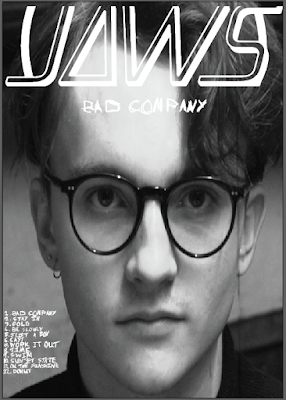
 This use of repeated motifs was again echoed through my digipak as I included a still of the actor as seen to the right looking directly into the camera, however due to the nature of my actors stare it makes it look as if he's looking at members of an audience or in the case of this whoever is behind the display that has the video or digipak on it. This ensures for the enforcement of a brand image. When I say brand image I obviously haven't used the members of the actual brand as it would be extremely hard to get them to communicate. So I settled with creating a brand for the actor in the video. This ultimately has led to a group of products the main video and the ancillary products that all share synergy. This means if somebody sees the full package of products they will see the effectiveness of the use of similar stills and styles. Creating an icon out of the protagonist that can be recognised on a wide scale if it was to take off.
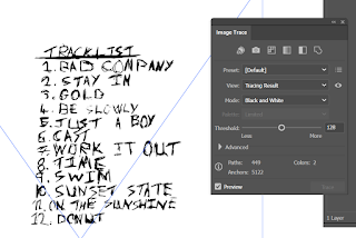
 I have already mentioned that I have used the repeated motif of mode of address and the use of black and white text to create synergy. However I'm yet to mention that the designs of my ancillary products are simplistic but effective - in keeping with the artists’ original style of out there concepts. Looking at the artwork produced by the artist, my ancillary products are similar. The layout and overall design of my products will attract audiences simply because there is an element of similarity as of the use of a story line we have all had explained to use and shown. The design also creates interest leading them to interact with the product. For example, the consistency of fonts shouldn't go unseen. My ancillary products demonstrate the highest level of synergy through my consistency in my choice of font. As I created my own font. This meant that there was no other font that looked like mine as I did it with pen and paper myself. To then scan into my computer and image trace into my project. This font I created was used in both of my ancillary products as both have the track list using the same font. As seen around this text. I took inspiration from original artists posters, for example the album artwork by RatBoy for MOVE. I made this creative choice because I knew that RatBoy was in the same genre as JAWS my artists. Thus taking advantage of their already established fan base. So they would see my ancillary products and recognise the similar font and therefore associate my product package with the indie genres image. Which in turn fulfills genre codes and conventions.
 Demonstrated throughout all of my products is the consistency in colour and texture. Colour within my products is vital in conveying my message to audiences, as well as reflecting the mood of my main product and ancillary products. Firstly, in my music video, I utilise bright colours, accompanied with dark blacks and shadows to accentuate the mystery and frustrstion that the actor feels. More specifically, throughout establishing cuts and transition footage, I create a visual semantic field of danger and uncertainty by editing the blacks and whites of all objects as of the black and white LUT I applied. So the message becomes more obvious. I also used these black and whites. That contrast each other which uses the concept of colour phycology that coerces audience members to feeling certain emotions, thus, I edited certain frames so that they are extremely contrasted with the colourful footage in order to provoke certain emotional responses from audiences.
  The way in which I mirrored this utilisation of colour in my DigiPak was by taking still images from the actual music video and using them in all sides of my design. To replicate the same response as I got in my actual music video. This same response as before is the response that I wanted as it caused audiences to infer from the DigiPak design, I took a still from the video that exhibited a shadow I created, I edited the image so that the blacks and whites both separated themselves from each other clearly– this was done in Photoshop using the colour correction white balance settings. Thus, linking back to my previously mentioned point about the repeated motif of the audience addressing that ties the products together in complete synergy. The close-image was utilised on the front cover of the DigiPak design, as the mystery it portrays as its and intense image that provides an enigma for audiences to engage with, thus coercing them to interact with my product.
 I wanted to keep the magazine advert relatively simple but engaging with enigmatic, mysterious iconography. We again see the mode of address shots are yet again
 included on the design, thus reinforcing my overall message of my products: reflecting a mysterious and scary vibe that was also found in all of my other products. I decided to keep the design minimalistic because I didn’t want to harass the audience with colourful and harsh image and font. As well as keeping the design relatively simple, I also included features that make the product easily accessible for audiences to interact with. With the use of a barcode so people can buy it or even the band name so people can buy the product.

No comments:
Post a Comment