Monday, 10 April 2017

Evaluation Question 3

"What have you learnt from your audience feedback"


Small section of an audience feedback blog.
My first steps at gathering research meant I was using the internet and Web 2.0 to produce feedback for the first cut of my music video. I took to blogger and created a blog with a questionnaire so I could use the link so I could send it to my audiences, where they could answer questions on my rough cuts that I have done so far. Which were available through a link on my blog which directed them to my YouTube channel Watt Productions. Where you can find all my videos front test footage to rough cuts and Goodwin’s theory of music videos. My questionnaire on my ancillary products was added which meant that my audiences could view the products at the same time. This enabled them to see my whole package. I also included links that would direct them to my ancillary products on my Media blog with analysis and development blogs on how I made them. Which ensured that when they answered the questionnaire they could make much more informed decisions.


Utilizing Web 2.0 was an incredibly effective way of gathering feedback as it is a platform that is used every day by my target audience, meaning, I was confident that I would gather appropriate responses from the correct people. In terms of making sure I addressed my demographic, I targeted a selection of people by going on Facebook and looking at people nearby and choosing people who fit my target audience of males around the age of 14-18, who in general are left leaning in political view. From this I formed a private list of people who could view the post as I sent them the link to my blogger and all other links needed. I targeted these specific people as they were the demographic that I believe would more than likely interact with my product if it was in and around the really market, and based on the feedback I received, I was right to believe what I previously stated. The shortlist of of my target audience was a collection of my friends and family and people of impartial beliefs including the band and the management team for the band themselves. I did this with a strong intention in mind, as I wanted to see if there were any differences in the feedback I received from the bias and non-bias participants and how it would alter the way in which audience members received and interpreted my product. I found that, from research, there was a consensus on the way the video portrayed the narrative and mysterious vibe I worked to put across to the audience. I also found that there were very few differences in how the bias and non-bias people received all my products.

Initial feedback from my blog was positive even, however there were a few people who came back with some great constructive criticism which I could work and to help my project benefit.


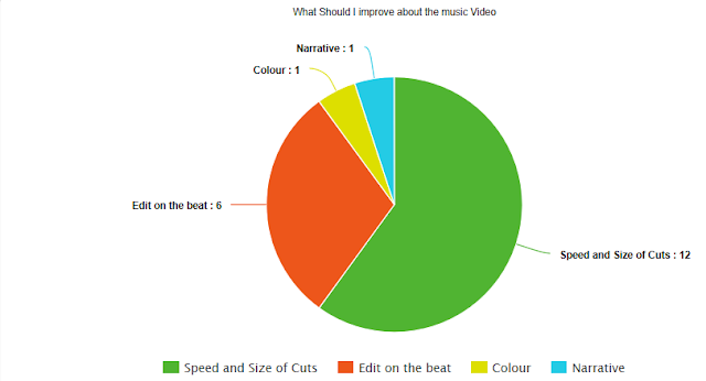
 Feedback showed that my conscious thoughts on mis-en-scene, lighting, colouring, narrative and technical elements (such as artificial camera movements) were brilliant. I also managed to successfully convey the overall mood and tone of the music video to my audiences, as they felt “compelled to think” but also “unnerved” and “intrigued”. In terms of my development of my products, some of my peers and other participants of the questionnaire suggested that I edit down some of the camera shots throughout the video, more specifically, making all clips shorter so they cut on the beat of the song to give a feeling that it is a music video not just a short film/ film opening appearance. After going back onto Adobe Premiere pro and amending the problems that were highlighted in my audience feedback, I noticed that the alteration of the shorter clips impacted the general spooky and unnerving effective of the video. But, I didn’t completely ignore their suggestions, I did alter the shots a lot making them much shorter, however I also made more shots have slow motion while having some just more extended. So, I did change not the video to the extent that the footage was edited to lose the desired unnerving fashion I looked for. This can be scene by watching through each of my Rough Cuts where you can see the size of each clip getting smaller through each one all the way to the final cut.


As well as altering the length of some of the shots and there duration, a couple members of my audience and participants of the survey suggested that I match the beat of the music to the editing during the whole production. I then went back to Premiere Pro again as I wanted to make sure I nail the music video and fully consider and use all suggestions. During using premiere I made sure I repeatedly looked over the music sequence and clips in order to get shots that transition on the beat. I found that it worked extremely well, emphasizing the element of cohesion and continuity within the visuals. I chopped the visual footage so that it joined with the bars that were evident within the music levels, so that every time a “beat dropped”, there would be a visual cut within the footage.


After completing my alterations to the video, I then reposted the music video link on my blog and asked my friends and peers and everyone else who last did the questionnaire if the rough cut looked better than previous. I was happy to see that nearly all of them agreed with the alterations that I made and said it added to the music video and really enhanced the cohesion and continuity of the video. Although, there was a friend that challenged my decision not to dramatically edit down video, as it caused it to rush through the narrative. But I quickly justified my reasoning, which she seemed to accept. As I explained later in the process I would be adding in inter titles that would further help entrench the narrative providing a recommended reading. Overall, it seems that the alterations that I made based the opinions of my audience demographic, worked extremely well and I achieved exactly what I wanted to creatively, whilst also fulfilling my intentions, this however had to be done with compromise.


As previously mentioned, that I took to blogger to design a questionnaire that was suitable and simple for my audience demographic to answer effectively as they would understand it. When designing the questionnaire, I knew that I wanted qualitative and quantitative data, as I wanted to gather statistics, as well as written opinions. This method of having both types of data is called triangulation.


Because I must evaluate the entire product package, I decided to include a variety of open and closed questions – some of which required the audience member to provide a number on a scale of how successful my products were as a whole and some of which required them to provide a reason for their answer. I was happy to see that all the written responses were positive, with key effect being in the simplicity of my products. As the questions on the questionnaire were appropriate as I didn’t want people to feel overwhelmed with outlandish questions and distracting fonts.


As I mentioned before, I wanted to investigate if not being one of my friends and family or acquaintances influenced the way in which my audience developed an understanding of my music video and other ancillary products. But if I looked at the feedback gathered form the survey and individual responses I received in person, there was no noticeable correlation on the way in which they interpreted or felt about certain micro-elements on my ancillary products or music video.


I found that the majority of people watched watched my production tended to be watched by predominantly by people are in between the 14-22 year old mark, who were mostly male. This fits with my target audience as I intended meaning all of the data I received is perfect for me. Most the responses were positive saying all the right things. With just a few suggestions for alterations which I talked about earlier. 


I was happy with the range of responses I received. This is because I managed to get people from all ages to replies to my emails. I took care in who I choose to go on my list to send the links to, by doing this I choose people of all different ages. From 14-60 because of this big age range I had to not use the social media page Facebook as not all people of this age use Facebook. Therefore, I choose to use email as everybody has access to it. 


A multiple-choice question allowed my audience members to choose which element on the DigiPak design was the most effective, this was done by offering option like front cover, back cover and fonts. Although 11 members answered that all elements of the design were effective, 4 people believed that the colour scheme I used was the most successful element, with 2 people each thinking that the layout, fonts/text and band logo were the most successful elements. Overall, I am very happy with the answers I received for this question, as I believe that the responses echo my success in my Digipak design.


As well as the DigiPak questionnaire I did, I provided the audience with another multiple-choice question; this time concerning the success of individual elements on my Magazine Advert.  Along with lots of others regarding the other elements.  There seemed to have even more of a consensus of responses about the elements of the advert, as only 11 people though that all of the elements were successful on the final design. Following close behind was the still alone on the advert as well as the fonts used. I am still extremely happy with my design and I believe that I made a conscious effort to make the advert relevant to members of my target audience, so according to my feedback, it seemed to pay off.


It was great to see that all of my audience answered that my all my products were professional and exiting – which puts across how I have successfully I was in completing my intentions of creating captivating and engaging set of products. Again, it is clear from feedback that 100% of my audience thought that my products successfully represented the band. I know this because I emailed all my products to the band themselves as they wanted to see them to ensure there were no copyright issues. And they replied that they thought all my products “looked great”.

As with all films and media texts, there are subliminal or more obvious messages that are woven into assorted products for audiences to decipher and interpret. The overarching, dominant message that I wanted audiences to interpret from my music video was that. The protagonist was lonely and as the song goes on goings through the planning and construction process of making his company with it all resulting in the new monster he has made killing him, with the general appearance of a old silent film. This fits with Stuart Hall, the audience can decide which reading to give a media text – either dominant, oppositional or negotiated. However, I believe that my audience members have received the dominant message that I was trying to portray throughout all my range of products.


My products relate to the Uses and Gratifications Theory through different audience interpretations of the messages that I have put into my products. On one hand, the audience fulfills the objective of being unnerved and entertainment, as they watch my music video, they should feel fully amerced in the storyline and feel that they are having their emotions played with.  


When it comes to my ancillary products, audiences should take entertainment when it comes to viewing the products that being both the DigiPak and Magazine advert; as of the colours, overall design and fonts may excite them and encourage them to form a reading, whether dominant, oppositional or negotiated.

In conclusion I believe that my audience feedback on all my products has helped develop them fully ensuring the success of my product.

Saturday, 8 April 2017

Evaluation Question 2

"How effective is the combination of your main product and ancillary texts"


During my A2 media coursework as you know from reading my blog I have had to create a set of products that all work together to make a finished package. These products include a music video and a mixed combination of ancillary products, of which are a digipak and a magazine advert. The mixture of all these products should technically or at least by convention all fit together regarding style. This is very much the case for me, as during the research process when making each product I found out that it's a basic convention that there is a certain level of considered synergy between products. So because when I took to planning and construction it was my main intention to create and demonstrate my skills to effectively create an array of products that share the same or similar mis-en-scene, design, layouts and colour schemes.

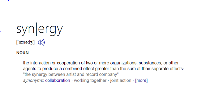
Earlier I talked about synergy however I didn't go into any detail into how I carried it out and what it is. The definition of synergy is.
The way I applied the concept of synergy was through several different micro elements. For example in my two different ancillary products I used the same font, and this was not just an ordinary font like Arial. I made it myself in order to create a brand for my protagonist, so he would be recognised along with this individualistic font. Which in turn creates a brand image throughout the ancillary products. Furthermore, when I was creating my digipak and magazine I made several different drafts during there developments, all with varying colours and colour combinations. I say this because I made the decision to have all text black and white I had pre decided I wanted my digipak in this style, then after when I was producing my magazine advert the variable that swayed me towards having black and white text again was not the positive audience feedback I received for this option. But in fact it was the conscious decision to create and encourage synergy between my ancillary products. This leaves a very effective combination of ancillary products producing links between the protagonist and certain micro elements that are shared in the different products.


I have created further synergy between all of my products by including repeated images and motifs, and still images that show my use of direct address to provoke responses from my audience of feeling evolved with the product as direct eye contact with the protagonist connotes that a story is going to be told and meant for the listener and viewer individually.  Furthermore, I editing to demonstrate a constant mood which is evident in all three products that I created. I can say with confidence that my video is not limited when it comes to being full of repeated signs. This is specifically shown through the use of the repeated motif of the protagonist looking into the distant even though he is inside in order to create a sense of the character to be performing or like he's in theatre; which is a micro-element that I intended to use to establish clear message which evidences itself throughout the video, meaning audiences are able to decipher both the obvious denotations as well as the connotations. I did this because it puts the video inline with the Reception Theory, as I have encouraged this idea of performing throughout the video it ensures people see it as a repeated motif. thus making it the dominant message that is implanted through the text and the message that I wanted audience to take onboard. However, as the reception theory goes it is entirely up to the audience whether or not they choose to accept the dominant message or not. But instead they may make a negotiated interpretation or a completely oppositional one.


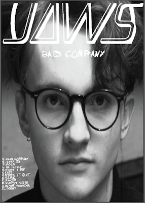
This use of repeated motifs was again echoed through my digipak as I included a still of the actor as seen to the right looking directly into the camera, however due to the nature of my actors stare it makes it look as if he's looking at members of an audience or in the case of this whoever is behind the display that has the video or digipak on it. This ensures for the enforcement of a brand image. When I say brand image I obviously haven't used the members of the actual brand as it would be extremely hard to get them to communicate. So I settled with creating a brand for the actor in the video. This ultimately has led to a group of products the main video and the ancillary products that all share synergy. This means if somebody sees the full package of products they will see the effectiveness of the use of similar stills and styles. Creating an icon out of the protagonist that can be recognised on a wide scale if it was to take off.

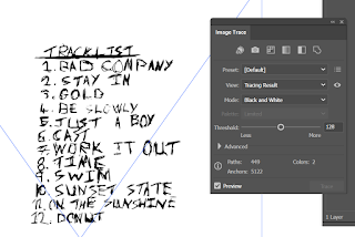
I have already mentioned that I have used the repeated motif of mode of address and the use of black and white text to create synergy. However I'm yet to mention that the designs of my ancillary products are simplistic but effective - in keeping with the artists’ original style of out there concepts. Looking at the artwork produced by the artist, my ancillary products are similar. The layout and overall design of my products will attract audiences simply because there is an element of similarity as of the use of a story line we have all had explained to use and shown. The design also creates interest leading them to interact with the product. For example, the consistency of fonts shouldn't go unseen. My ancillary products demonstrate the highest level of synergy through my consistency in my choice of font. As I created my own font. This meant that there was no other font that looked like mine as I did it with pen and paper myself. To then scan into my computer and image trace into my project. This font I created was used in both of my ancillary products as both have the track list using the same font. As seen around this text. I took inspiration from original artists posters, for example the album artwork by RatBoy for MOVE. I made this creative choice because I knew that RatBoy was in the same genre as JAWS my artists. Thus taking advantage of their already established fan base. So they would see my ancillary products and recognise the similar font and therefore associate my product package with the indie genres image. Which in turn fulfills genre codes and conventions.

Demonstrated throughout all of my products is the consistency in colour and texture. Colour within my products is vital in conveying my message to audiences, as well as reflecting the mood of my main product and ancillary products. Firstly, in my music video, I utilise bright colours, accompanied with dark blacks and shadows to accentuate the mystery and frustrstion that the actor feels. More specifically, throughout establishing cuts and transition footage, I create a visual semantic field of danger and uncertainty by editing the blacks and whites of all objects as of the black and white LUT I applied. So the message becomes more obvious. I also used these black and whites. That contrast each other which uses the concept of colour phycology that coerces audience members to feeling certain emotions, thus, I edited certain frames so that they are extremely contrasted with the colourful footage in order to provoke certain emotional responses from audiences.

The way in which I mirrored this utilisation of colour in my DigiPak was by taking still images from the actual music video and using them in all sides of my design. To replicate the same response as I got in my actual music video. This same response as before is the response that I wanted  as it caused audiences to infer from the DigiPak design, I took a still from the video that exhibited a shadow I created, I edited the image so that the blacks and whites both separated themselves from each other clearly– this was done in Photoshop using the colour correction white balance settings. Thus, linking back to my previously mentioned point about the repeated motif of the audience addressing  that ties the products together in complete synergy. The close-image was utilised on the front cover of the DigiPak design, as the mystery it portrays as its and intense image that provides an enigma for audiences to engage with, thus coercing them to interact with my product.


I wanted to keep the magazine advert relatively simple but engaging with enigmatic, mysterious iconography. We again see the mode of address shots are yet again
included on the design, thus reinforcing my overall message of my products: reflecting a mysterious and scary vibe that was also found in all of my other products. I decided to keep the design minimalistic because I didn’t want to harass the audience with colourful and harsh image and font. As well as keeping the design relatively simple, I also included features that make the product easily accessible for audiences to interact with. With the use of a barcode so people can buy it or even the band name so people can buy the product.

In conclusion I feel like my main product and ancillary products work perfectly together, making for an effective industry like package.

Evaluation Question 1

"In what ways does your media product use, develop or challenge forms and conventions of real media products?"


Wednesday, 5 April 2017

Evaluation Question 4

"How did you use media technologies in the construction and research, planning and evaluation stages"

For my evaluation question 4 has been answered by me in this Prezi

https://prezi.com/u1laupfhga8m/evaluation-question-4/#

Sadly I was unable to embed the Prezi so above is the link.

Monday, 27 March 2017

Audience Feedback On Final Cut + Questionaire

1) Does my video have a strong narrative?
Yes
No

2) Does my video look like an old silent film?
Yes
No
Slightly

3) Do you think my video suits the overall song?
Yes
No

4) Would you watch a similar video?
Yes
No

5) Were you aware of what was going on?
Yes
No
At parts

6) Did you think the video was entertaining?
Yes
No

Sunday, 26 March 2017

Final Cut- Production Diary


After three Rough Cuts I have finally created my final cut for my A2 media coursework. It is a narrative video using the song Bad Company by JAWS. The narrative will follow the life a one man creating an idea of having his own "monster" or "company" which eventually is the death of him.

From the previous Rough Cut 3 I have made some improvements from colour correction, to adding in titles and ensuring the final improvements like font corrections.

Firstly, I made several adjustments with the matter of colour correction. However they were not major as it was just me going through each clip and double checking all the clips had the same look due to some lighting being changed. So I overall I feel this has had a good effect as it has meant all the clips even if they started out looking completely different all now merge together which results in more pleasing viewing.

Secondly I have finally completed the titles for my coursework production and overall I'm very happy with them. The intertitles have turned out just how I first intended as they add to the general aesthetic of the silent movie I wished to create. To choose what my titles said I had to research into intertitles, and I found that they conventionally use text to display speech in the scene. So I copied this and added in the following titles. All these titles ensure a clear narrative and the enhancement of the aesthetic.

Finally, I had to choose the correct font I wanted to use as previously I had only used random font to fill the space. I then took to the internet to research silent movie fonts and found a font on dafont.com called Silentina font which looks like a almost exact replica of ones seen in adaptations of Frankenstein and Nosrefatu.

Overall I'm very happy with the music video, and to see in-bias opinion look on the audience feedback section of my blog.

Rough Cut 3- Production Diary


This Rough Cut has had several changes compared to the last one such as the new added bars at the side like the traditional silent film and of course the removal of the bars at the top and bottom of the screen. Also obviously the titles I have added in in order to follow the conventions of normal silent films as well as further developing the narrative of my story line. And not forgetting the artificial camera movements I've added in.

However, first I will first talk about the cinematic bars I've added in. This was done to more accurately replicate the look I wanted as it ensures that the video appears as if I have a scale of 4:3 instead of 16:9. So we see very significant changes in this department because I really feel it has helped complete the over all aesthetic of the video. We can see the new borders in the image to the right of the text an below we can see what the video used to look like.


Secondly as I mentioned before I have added the intertitles I've previously blogged about. This has allowed me to create a full video that is on the beat of the song. As seen by the way the shots will cut or transition on beat of the song. I did this by using the ripple tool on premiere pro which allows the dragging of the size of two clips simultaneously. By using this tool I also made sure to zoom in on the wave forms of the music file itself to make for accurate cutting on the beat.


Finally I also added in some new artificial camera movements that I learnt how to do on YouTube by watching several videos on the matter. To add more context when I say artificial camera movements I mean when I have take an ordinary shot place it in a premiere pro timeline and make sure that the effect controls panel is open. Then I would go to the start of a clip and add a key frame at the scale position and any other variable I want and then move over to the last frame of the shot and then change the variables to where I want the shot to end up. Then all there is to do then is to render the file through and review it and depending on the variables you change you may create a zoom as we see in the shot of just the protagonists face or even just a pan. Below you can see the effects panel and program monitor so you are able to see some values to give more idea of how it is  done.

Friday, 24 March 2017

Rough Cut 2- Production Diary


Here is my second rough cut, I have made several developments that are noticeable including the use of Luts (Lookup table) which are simply just a preset collection of colour values that create certain Luts. I used the Lut seen in this picture in the effect controls- Creative section. It is called SL NOIR  TRI-X, I was lucky in the fact I found one that already sat within premiere pro.

They make a very significant difference to how the music video looks. As seen by the difference in the overall appearance of my 1st rough cut and this one.


Rough Cut 2 with LUT
Rough Cut 1 no LUT, saturation value 0
The application of the LUT as can be seen has made a huge difference to the quality of the footage as we can clearly see how the whites instantly look less blown out compared to the first rough cute. Furthermore it also enhances the blacks and shadows in the clips as seen by the larger shadow created by the shelf behind the protagonist. Finally, when you take a look in and around of the glasses it brings out more reflection and detail to the point you can almost pick out the pattern on the glasses. It also helped with a certain level of colour correction however this happened at a later point.

I also made several changes to the edit by creating much shorter cuts especially at the start, furthermore I worked to ensure it was more on the beat then previous times. This made it seem more like a music video then just a short film which is often hard to distinguish with my strong narrative my production relies on. In fact if you watch my video compared to my first rough cut the story is much further ahead than before with it being several shots ahead, but of course this had to be done to prepare for my third rough cut with titles inserted. This will then mean I will near a final cut however there is still along way to go with every clip to colour grade using the scopes I previously learnt to use.  

Thursday, 23 March 2017

Rough Cut 1- Production Diary


Above we see my first rough cut of my A2 music video. It is a basic culmination of all of my shots, it has no special effects apart from the fact I created an adjustment layer and adjusted the saturation value to nil, and added in cinematic bars at the bottom and top. I'm happy in general with the edit as it has the start of what I aimed to do. However it is still without the intertitles I plan to insert, but in the time being I shall just add dummy titles in so I can edit to the beat of the song as at the moment there is no point of accurate on the beat editing as I will only have to change it in later edits. Furthermore, I plan to colour correct my whole video by adjusting the basic settings such as highlights, shadows, blacks, whites, saturation and exposure. I may also look for a more appropriate lookup table (LUT), in order to improve the general aesthetic of the whole production as it produces a more cinematic look compared to the use of saturation which I currently have in place. I'm also considering changing the bars at the top and bottom of the screen and instead moving them to the sides to replicate the 4:3 frame old silent films have. Finally I feel the use of some new transitions at the end of the production would help tie the narrative together as it will bring a sense of continuity, as at the moment I feel the cuts feel robotic leaving a narrative which is unclear.

Monday, 20 February 2017

Final Magazine Advert


This here is my final magazine advert, as we can see I have a white band logo one which replicates a similar logo that has already been established by the band themselves. The white text I chose was in order to keep with the black and white silent film look, I did this because it makes the whole production more professional.

I also then proceeded to make my own font by drawing in normal biro pen and scanning it into my printer and scanner. I then put the scanned file on the memory stick and placed inside my computer, and opened it in Illustrator. Then I did the same as I previously did with my digipak and image traced the image After other tweaks I finally created this text font effect. Which I'm happy with overall.

I followed conventions of magazine adverts by adding the music production companies logo, this was hard to do as I was unable to get a vector online so I simply took a normal Jpeg and again image traced, which aloud me to create an image which appeared to be a vector. Finally I also made the colour of the production companies logo a grey transparent colour this was because the shape of the logo with the circular curves. As I did not want it to be predominate as most of my design has no smooth bendy edges.

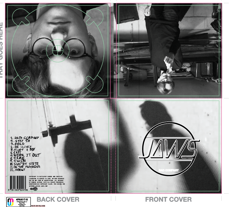
Final Digipak


This is my final digipak, as you can see I have 3 different pictures on my digipak instead of the normal 4. This was done to purposely break conventions as it represents how my video is not the normal everyday video.

I also used my own font for the track list much like I did in my magazine advert. Furthermore I have also previously described how to put in my own pre made text in a different blog so refer to that for a description.

Also I found a vector of the rattle pop logo and a random barcode. This was useful as it meant I was able to easily for fill genre conventions. This is useful as it provides a familiar layout to that of a more professional real digipak.

Something that has not been seen on my magazine advert is the different pictures I used for example the one at the bottom of the two shadow figures. These were used because it provides mystery, which fits the genre of my video as throughout it has a storyline which is only revealed at the end so there is always an atmosphere of mystery and anticipation. Finally there is the close-up of the protagonist under where the disc is meant to be which would mean we would have the characters face reveal in a certain way.

Overall I really like my digipak as it fits my theme and looks like a typical digipak in my genre. However that is not to say that it is a copy of any other digpak's as it is very individualistic, mainly because they are actual screenshot of my A2 music video.

Digipak Questionaire and Results

This questionnaire is very simple and has been put together in order to decide which digipak I will use for my final product.

Answer- Cross out the corresponding letter for the one you prefer.

A)
B)
C)
D)
E)


Results

From this questionnaire I have found out that I will use E as my final digipak as it got an overwhelming amount of votes with 16 of the possible 40 available. Although this is not a majority compared to the variation  D it has twice as many votes. This is significant as D got the second most votes. Peoples reasoning for voting for E was because it had the most simple and appealing colour way. With the JAWS badge being black and white instead of black and transparent or yellow and transparent. People really did not like A as they felt that yellow was an intrusion on the silent film aesthetic I have in my whole production. While people felt C and D were to similar so it probably split the vote.

Sunday, 19 February 2017

Magazine Advert Questionaire and Results

This is a questionnaire which when complete will allow me to choose the appropriate magazine advert for my AS coursework.

Cross out the letter that corresponds with the magazine advert you prefer.

A)

B)
C)

Result


The results show that B with the digipak has the most votes with a majority 28. The reasoning people gave to that was again much like the results with the digipak with the fact people preferred to keep the black and white aesthetic throughout the overall production. As they felt it created a more professional brand image. People felt that the red one did not sure indicative of love and romance than horror and said maybe I should have offered a yellow option as it is currently on trend. But I will not offer a magazine advert which is yellow as the digipak has been won by a black and  white option. So there is no need. 

My Final Magazine Advert's (Devleopment)

I have done a blog on the codes and conventions that consists of a list of typical things we see in music artists magazine adverts. During creating the following adverts I  followed those conventions however I did also go against some of them.

In this version of my magazine advert I made a variation with the yellow font of the text Bad Company.

In this version we see the Bad Company text and the track list in a red colour that could symbolize blood.

This is the simplest of all the designs with all the text a solid white colour, if any I prefer this one however I do plan to have a questionnaire to gain audience feedback in order to pick which on people prefer.   

My Final Digipak's (Devleopment)


When I created my Digipak I decided to create several versions of it which show a change in font, font colour and image position. In general I followed the conventions of Digipak's by using the typical barcode, band name, track list and record label symbols. In total I created 5 different variations of the digipak as seen below.

In this version of the Digipak we see the black and transparent JAWS logo and my handwritten track list which has been position in the bottom right of the back cover in a era yellow colour.  

In this version of the Digipak we see difference from the first one with the track list still being on the back cover however it has been made larger and put to the bottom left of the cover. Furthermore it has been made black in colour. Finally, other colour changes come in the new white colour of the record label and the Barcode.

In this version of the Digipak, I slightly changed the JAWS logo by making the Text and outlines white instead of an all black logo.   

In this version of the Digipak there is an obvious difference in that we see the JAWS logo is in fact yellow along with the track list text.


In this version of the Digipak, we see just a white track list instead of like a similar in that has the white text and a partly white logo.
I plan to create a questionnaire in order to pick which will enable me to choose the Digipak I will use.

Friday, 17 February 2017

Codes and Conventions of Magizine Adverts (Research)

  • Following the codes and conventions of a print advert, the advert should have one striking image that captures the audiences attention and intrigues them to find out more.
  
  • The poster must follow the required size of what the channel requires. Usually A4 landscape • The slogan must attract the audience and also anchor to the image.  

  • The print advert must include the channels logo, While producing ours for channel 4 we had to follow guidelines of the size and placement of the logo.
     
  • The scheduling information should be clear for the audience to see, it should present the date, day and time, also sometimes should be placed in a colour block to make it stand out to the audience even more. 
  
  • There must be a simple colour scheme.- The name of the program should also be presented in a colour block. 

  • There must be a simple colour scheme.- The name of the program should also be presented in a colour block.
I have looked into some other artists magazine adverts and found the following characteristics.

Calvin Harris I create disco album, We can see in the picture above there is large text placed on each side of the main graphic in the middle that reads the artist name. Obviously it is a convention to have the artist name as it is essential to push and artists brand image. It is also one of the most dominating parts of the magazine advert which is typical of any magazine advert.

Furthermore the text which reads "I Created Disco the album" is, of course, as the name of the album. The use of a date after this ensures the viewer is aware of when the album is out, allowing them to purchase it. Then we can see in smaller writing that reads "includes the singles". This denotes what tracks are included within the album and may attract the target audience as if they recognise the song names they may decide to purchase the album. And obviously this is the main purpose of a magazine advert.

We can see in the bottom right hand corner of the poster a promotional picture for amazon which of course tells people and audiences where to buy the album, potentially securing a purchase. Also we see the log of the record label again allowing the viewer to identify who produced the music.

Other design choices such as the yellow used for the background which connotes happiness, ensuring a chilled, cheerful vibe which may make the viewer feel good. This should in term draw them in as It will encourage the purchase the album. Again with colour we can look at the black and white head of the artist himself. These colours help him to stand out creating an eye catching contrast for the viewers.


Digipak Conventions (Research)

What is a Digipak?

A DigiPak normally has what is called a gatefold like a book. The outer packaging is often made of made of card/paper and the inner packaging tends to be made of plastic. They are normally used on special editions and albums by artists as they as seen to be more exclusive. Furthermore they have there downsides as they can be more vulnerable and likely to wear than the average hard back CD case. They first became popular with artists and record labels in the early 2000s .

DigiPak's are designed to fold into a square CD case. They can fold many different ways and can have different amount of panels depending on what the artist feels he wants to involve. The front and back panels are called promoters’ and they are what is seen to cell the CD and are very much used to draw in the customers. The inside of the DigiPak is used more for information and extra bits to do with the artist/song/album. The theme of the inside packaging normally is more subtle compared to the outside packaging. The cardboard/paper normally folds around the plastic CD holder that is enclosed in the middle of the folds.

What tends to be on the front of Digipak's and why?

The front of DigiPaks tend to have a large eye-catching picture on the. The picture illustrated on the front panels tend to have some relation to the songs or artist this obviously varies between music artists as of the genre. The song/album title is also found on the front panel. This is all displayed by the picture we see to the right.
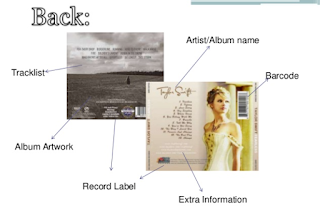
What is found on the inside of a digipak?

Artist/Album name Track list, barcode, album artwork, record label  and any other extra information the artists wishes to be on there. In extended detail you could say you find the following inside a DigiPak. The plastic holder for the actual CD itself. A lot of plastic holders nowadays are see-through with another piece of album artwork behind which goes with the rest of the packaging. You can also find inside the pack itself more information and possibly more artwork to do with the disc. Extra information provided within the packaging could possibly include song lyrics, artist information and personal messages.

In Conclusion the following is normally found on a Digipak:

  • Track list
  • Album artwork
  • Record label
  • Extra information
  • Barcode
  • Artist name
  • Album name
I have also done a digipak analysis as I think it will help me explain and improve my knowledge of digipaks and what you would commonly see.
Image result for Loud Digipak


For example here is one on Rihanna's Loud album. We firstly notice a large image on the inside of the digipak which presents the viewer with a lot of emotion a is bold and uses deep red roses which connote love while we also notice the artist laid over the splayed over them which may signify weakness or vulnerability. The image is defiantly eye catching to say the least, as it makes the audience think trough what the image means as of the mix match mise-en-scene that has been setup. We also see the use of the male gaze by showing the artist in what is arguably a seductive look. This may be because she wanted to reach out to the male audience or even a lesbian audience.

Secondly the typographic used in the inside cover and on the front is very minimal. With only the name Rihanna displayed and the albums name of course which is "LOUD". This is placed upon the front cover, above and below the bold image of the protagonists face. The white text was used as it is able to stand out because of the colour of the artists skin and hair. The White text connotes pureness and adds to both the feminine and romance theme which exist through the digipak. There is unusually no text within the digipak however I think this is because the image are meant to be the main part of the digipak so it is more of a statement of the artist to get herself more recognised and create a brand image.

Finally, we see the image on the very front of the digipak. The first thing that jumps out at us is the contrast between the text LOUD and the picture of the artist looking calm and essentially the polar opposite to what the text may try to present her. We also see her lips as a dominant part of the image as they are a blood red colour which again denotes love or romance.

I also did some research on Katy Perry's Teenage dream digipak which can be see below.
Image result for katy perry teenage dream digipak

On the front cover, we see the main text illustrating the artist's name and the album name which has been out near the top and bottom of the cover, it has been done this way so that the image of the artist is kept in a sandwich layout and, therefore, shows her as the most significant item within the design. This is a good style to use as its layout encourages the audience to look from top-to-bottom. The use of the colour pink does connote sweetness and innocence to the title; encouraging the audience to take a further look within the digipak as they feel as if it may be an easy listen or read of any text inside. The background of the cover is the artist seductively laying upon pink clouds  this is likely to be because the artist wants to use the male gaze in order to sell albums much like the album LOUD I talked of earlier. The image focuses upon the artist's image and how she's portraying herself to her audience, being her first hit album and her breakthrough into the music industry as a worldwide artist. It's made clear that the album contains some connotation and denotation of sexuality mixed with the idea of a teenager's dreams of love, further indicating that she is using this theme to appeal to her young audience to help boost her career.

Secondly the back cover continues to follow through with the sweet theme, however they have made sure it is kept away from the artist's image, as shown through the font used to name the track titles. The is a bold colour red which allows the design to keep up the same look creating a feel of consistency of the candy cane theme and helps the text stand out against the fluffy, pink clouds. Additionally, the text is stocky and has a sweet-related connotation that continuously connects with the overall theme. A small portion of the text is presented very differently against the red text in a bright blue (a similar colour to the sky pictured in the top third of the design) and is positioned differently so it is eye-catching to the audience. This position is often seen in digipaks and its has importance as it promotes the extra CD as part of the packaging that provides extra tracks for the audience, something that will appeal to them as consumers.


Finally we see the inside design, Katy carries on with the sweet theme it thrives as a main factor to the album's design although does involve the artist's image more; following Goodwin's Principles of keeping the artist's face in full view of the audience. In one image, there is a closer shot of the artist laying on her back on the pink candy floss cloud. She is still visibly naked and this emphasises the idea of the male gaze which plays a huge role along side the significant contribution of  innocence and sweet things within her music; also portraying the artist's confidence with herself which will encourage consumers to further look at the digipak. Additionally, the leaflet left inside sees her wearing clothing but in a more princess-like manner which presents a contrast with the artist's vision for the album.